
Flourish: Visualizing Data in an Easy and Engaging Way
— by Vivian Qiu
Flourish is an online data visualization tool that can help turn complex datasets into engaging and informative visuals in an easy way. In this blog post, we will introduce what Flourish could do for you, its advantages and how to use it.
1. What is Flourish
Flourish empowers users to transform raw data into compelling figures in easy steps, with a user-friendly interface and various customizable templates available. It provides a handy way to present complex information or tell stories from data in a visually appealing and interactive format. Flourish is also part of the Canva family, an online graphic design tool for creating visual content. Its integration with Canva allows you to import your visuals created on Flourish to your presentation slides on Canva directly.[1]
2. Why use Flourish
You can leverage Flourish to communicate insights of data effectively, drive engagement of audience, and enhance the impact of their data-driven narratives. Table 1 lists several key characteristics of Flourish and the benefits that they could bring.
| Characteristics | Benefits |
| User-friendly interface | You can create visualizations with a few simple clicks, and you are not required to have knowledge in coding or programming. |
| Free of charge | You can use basic functions in Flourish free of charge. Functions available in the free version could cover most of the common scenarios. |
| Interactive visualizations | You can engage and captivate your audience with interactive data visualizations. |
| Wide range of customizable templates available | You can create your visuals easily by selecting from dozens of templates available in Flourish. They can be customized based on your needs. |
Table 1: Flourish Characteristics and Benefits
3. How to use Flourish – Basic steps with example
The following paragraphs will demonstrate how you could use Flourish step-by-step with a set of sample data. First, figure 1 shows the workflow of creating data visualizations on Flourish.
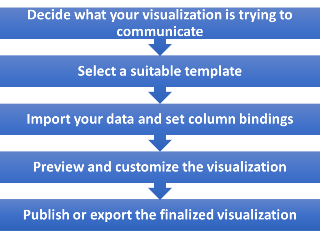
1) Decide what your visualization is trying to communicate
Good data visualizations always come with a clear goal. Think what you are going to tell your audience with the visualization. For example, the changes in sales of a product over the past five years, ranking of the top selling products, correlation between two variables, etc. You may find the below listed data information categories useful when you are deciding the right visualization for your data.
| Category | Example visualization type(s) | ||
|---|---|---|---|
| 1. Change over time |  Line Line |
 Area Area |
 Column Column |
| 2. Size | Column |
 Bar Bar |
 Grouped Bar Grouped Bar |
| 3. Parts of a whole |  Pie Pie |
 Donut Donut |
 Treemap Treemap |
| 4. Correlation |  Scatter plot Scatter plot |
 Bubble Bubble |
 Column + Line Column + Line |
| 5. Ranking |  Ordered bar Ordered bar |
 Line chart race Line chart race |
 Slope Slope |
| 6. Distribution |  Dot plot Dot plot |
 Box plot Box plot |
 Violin plot Violin plot |
Table 2: Examples of Data Information Category, Visualization Types and Flourish Templates[2]
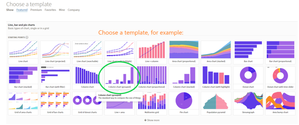
2) Select a suitable template
Flourish offers a wide range of data visual templates. Choosing a template for your visualization could save your time. Let’s take a set of sample data of showing the fossil fuel sources and low-carbon sources in different countries as an example in the following explanations. We decided to opt for the “grouped column chart” to emphasize the value of the sources available in each country.
3) Import your data and set column bindings
Once you have decided the right visualization template for your data, you may begin importing your data into Flourish. Since Flourish accepts any comma-separated values (CSV) files, data values and columns may not always be in order. The column that you want to use as a value could be in Column A, or in Column D, etc. That is why you should also set “column bindings”, which is an action that tells the template which columns of data should be used for what.[4]
In the example shown in Figure 3, we labelled Column B-C (i.e. the sources) as “values” and Column A (i.e. country names) as “labels/time”.
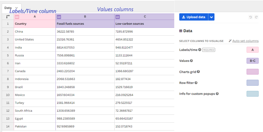
More on: https://helpcenter.flourish.studio/hc/en-us/articles/8761545383183-Adding-data-to-a-template
4) Preview and customize the visualization
Once your data has been successfully imported and defined, you will be able to preview your data visualization. Further customizations are available in the Settings Panel of the visualization editor.
In the preview panel, you can click on the bars and other elements to preview its interactivity. For example, in Figure 4, you may click on the fields “fossil fuels sources” or “low-carbon sources” to exclude the values of the selected field from the graph.
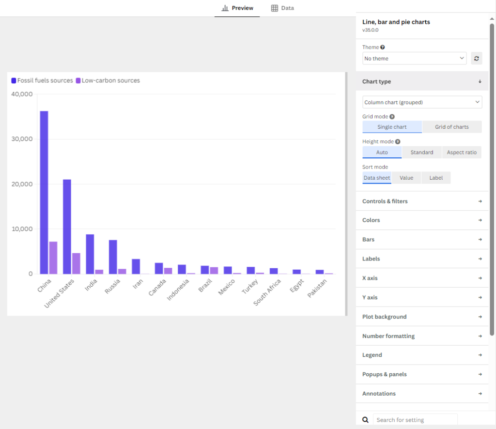
In the settings panel, you could customize the look and feel of your visualization, including but not limited to background colour, margins setting, header and footer, titles and value scale on X and Y axis, labels, etc. In case you may require more explanations for the setting elements, you may move your cursor and hover on the “question mark” icon nearby the element’s name for a detailed description. A search box is also available for quick access to a specific setting element. Figure 5 shows an example of a customized bar chart using the sample data.
Figure 5: Customized Visualization Example
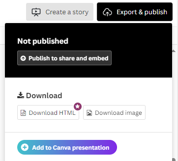
5) Publish or export the finalized visualization
When everything is ready, you can export or publish the visualization for sharing, integrating to reports and presentations, or embedding it onto webpages.
Examples of animated and zoomable visualizations
Apart from the basic types of visualizations, you can also create visualizations with more engaging functions like animation. Figure 7 shows a bar chart race visualization with all the bars animated, showing changes over the years, and Figure 8 is a zoomable visualization that readers could interact with it.
Figure 7: Bar Chart Race Visualization Example in Flourish Template
Figure 8: Zoomable Hierarchy Visualization Example in Flourish Template
More visualization examples can be viewed at https://flourish.studio/examples/.
4. Resources for Flourish tutorials:
Flourish also provides extensive resources to assist users in creating visualizations. More tutorials for the basic usage of Flourish can be accessed through Flourish: Beginner.
Want to have a try on Flourish? Sign up, and the template chooser is the place for you to start.
References
[1] “About us,” Flourish. Accessed: Oct. 09, 2024. [Online]. Available: https://flourish.studio/company/
[2] “Choosing the right visualization for your data,” Flourish. Accessed: Nov. 29, 2024. [Online]. Available: https://helpcenter.flourish.studio/hc/en-us/articles/8761551004815-Choosing-the-right-visualization-for-your-data
[3] “Choose a template in Flourish,” Flourish. Accessed: Nov. 29, 2024. [Online]. Available: https://app.flourish.studio/templates
[4] “Adding data to a template,” Flourish. Accessed: Oct. 09, 2024. [Online]. Available: https://helpcenter.flourish.studio/hc/en-us/articles/8761545383183-Adding-data-to-a-template

